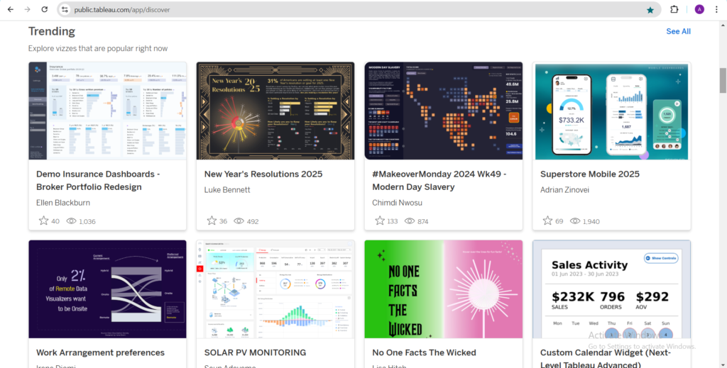
My First Encounter with Tableau
I still remember the day I opened Tableau for the first time. I had just downloaded the software, full of excitement and curiosity, but as the blank workspace loaded, I felt a twinge of doubt. Could I really create something meaningful out of what looked like an intimidating interface? At the time, I was transitioning into data analysis, eager to build my skills and explore new tools. Tableau seemed like the perfect place to start, but I had no idea where to begin. How to Create Your First Tableau Dashboard
The first few minutes were overwhelming. I didn’t even know what a worksheet was supposed to do, let alone how to create a dashboard. But instead of letting the fear paralyze me, I decided to treat the experience like a puzzle. I’d take it one step at a time and see what I could piece together. Looking back, I’m so glad I did. That first Tableau project not only taught me the fundamentals but also gave me the confidence to keep going. Here’s how I made it through and how you can too. You should check my post on the Beginner’s Guide to Tableau here!
Step 1: Connect to Your Data Source
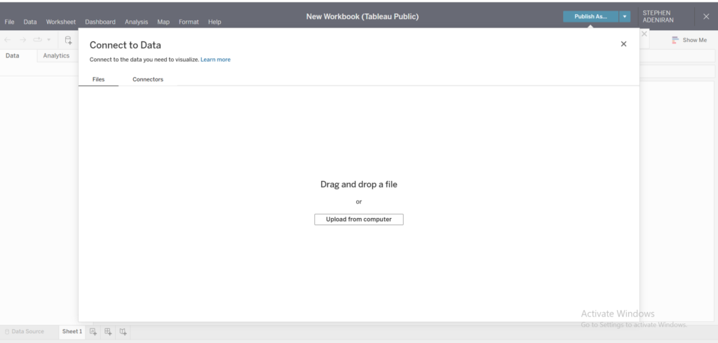
The journey began with finding a dataset to work with. At first, I didn’t have anything fancy, so I chose a simple Excel sheet that tracked monthly sales for a small retail store. It wasn’t glamorous, but it was a start. One of the first things I learned was that Tableau is incredibly flexible when it comes to connecting to data. From Excel files to SQL databases, even Google Sheets, Tableau makes it easy to pull in your data.
When I uploaded my dataset, I noticed something interesting. Tableau automatically recognized my column headers and categorized the fields as either dimensions (qualitative data) or measures (quantitative data). This was my first “aha” moment. Instead of spending hours organizing the data manually, Tableau did it for me in seconds. It felt like magic.
Of course, there were a few hiccups. Some fields weren’t formatted correctly, and I had to clean the data before proceeding. For instance, dates were stored as text, so I had to reformat them. Tableau’s Data Source page was a lifesaver here. It allowed me to make quick adjustments without going back to Excel.
Step 2: Choose the Right Visualizations
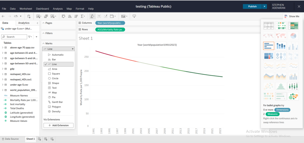
Once my data was ready, the next step was deciding how to visualize it. This was where the real fun began. Tableau offers a wide variety of chart types; bar charts, line graphs, scatter plots, maps, and more. At first, I was tempted to try them all. I dragged and dropped fields into the Rows and Columns shelves, creating everything from pie charts to heat maps. It was exciting to see the data come to life, but it quickly became clear that not every visualization was useful.
One of the most valuable lessons I learned during this stage was the importance of simplicity. Just because Tableau offers dozens of visualization options doesn’t mean you should use them all. I realized that the best visualizations are the ones that tell a clear story. For example, a simple line graph was perfect for showing sales trends over time, while a bar chart worked well for comparing sales across different regions.
Another tip: Use Tableau’s Show Me panel as a guide. It suggests the best chart types based on the data you’ve selected. This feature was incredibly helpful when I wasn’t sure how to present certain insights. Over time, I developed an instinct for choosing the right visualizations, but in the beginning, the Show Me panel was my go-to resource.
Step 3: Build Individual Charts
With my visualizations planned out, it was time to build the individual charts. This part felt like assembling the pieces of a puzzle. Each chart represented a different aspect of my dataset, and together, they would form the complete picture.
One of the first charts I created was a line graph showing monthly sales trends. It was as simple as dragging the date field to the Columns shelf and the sales field to the Rows shelf. Just like that, a line graph appeared. I remember feeling a sense of accomplishment. It was a small step, but it was tangible progress.
Not everything went smoothly, though. I struggled with filters and formatting at first. For example, I wanted to filter the data by product category, but I didn’t know how to add a filter to the chart. After some trial and error, I discovered Tableau’s Filter shelf. Dragging the product category field to the Filter shelf allowed me to narrow down the data. It was such a simple solution, but it made a huge difference.
Formatting was another challenge. I wanted my charts to look professional, but the default settings weren’t always ideal. I spent a lot of time tweaking colors, fonts, and labels. While it was frustrating at times, it taught me the importance of attention to detail. A well-designed chart not only looks good but also makes the data easier to understand.
Step 4: Assemble Your Dashboard
Once I had my individual charts, it was time to assemble them into a dashboard. This was where everything came together. I dragged each chart onto the dashboard workspace, arranging them in a way that told a cohesive story. It felt like designing a poster or a presentation slide. Every element had to fit together seamlessly.
One of the biggest decisions I faced was the layout. Should I place the charts side by side or stack them vertically? Where should I put the filters? I experimented with different arrangements until I found one that felt balanced. My goal was to make the dashboard intuitive and user-friendly.
Another important aspect was adding context. I included titles, captions, and tooltips to help users understand the data. For example, I added a title that summarized the main insight: “Monthly Sales Trends and Regional Comparisons.” I also used tooltips to provide additional details, like specific sales figures for each month.
The finishing touch was adding a color scheme. I chose a palette that was visually appealing but not overwhelming. Tableau’s built-in color options made this easy. I learned that consistent colors can make a dashboard look more polished and professional.
Step 5: Add Interactivity and Publish
The final step was adding interactivity. This was the part that truly brought the dashboard to life. Tableau allows you to add filters, actions, and other interactive elements that let users explore the data on their own. For example, I added a filter for product category, so users could focus on specific categories. I also created a hover action that highlighted related data points when the mouse was over a chart.
Adding interactivity was like putting the cherry on top. It made the dashboard more engaging and gave users the freedom to explore the data in a way that was meaningful to them. I remember testing the filters and actions, feeling a sense of pride every time they worked as intended.
Finally, it was time to publish. I clicked the “Publish” button and shared the dashboard with a small group of friends and colleagues. Seeing their reactions was incredibly rewarding. They were impressed by how easy it was to navigate and understand the data. Their feedback gave me the confidence to share it more widely.
Lessons Learned and Final Thoughts
Creating my first Tableau dashboard was a journey of discovery. It wasn’t perfect, but it taught me so much about data visualization and storytelling. Here are a few key takeaways:
- Start Simple: You don’t need a complex dataset or advanced skills to create a meaningful dashboard. Start with what you have and build from there.
- Practice Makes Progress: The more you use Tableau, the more intuitive it becomes. Don’t be afraid to experiment and make mistakes.
- Focus on the Story: A dashboard is more than just a collection of charts. It’s a tool for telling a story. Keep your audience in mind and design with purpose.
- Embrace Feedback: Sharing your work with others can be nerve-wracking, but it’s one of the best ways to learn and improve. Listen to feedback and use it to refine your skills.
To anyone who’s just starting out with Tableau, my advice is simple: take it one step at a time. Don’t worry about creating a masterpiece right away. The important thing is to start. Before you know it, you’ll be creating dashboards that not only look great but also deliver real insights. And trust me, there’s no better feeling than bringing data to life.